How to Measure Digital Marketing Impact for Nonprofits
Originally posted on Whole Whale – How to Measure Digital Marketing Impact for Nonprofits
Digital marketing is a catch-all term for the act of promoting services or products through media across varied digital channels. When this term is applied to the nonprofit sector all that changes is that services/products are designed to provide a societal benefit. This is where things begin to become more complicated for nonprofits than their for-profit counterparts. It is clear for a company like Amazon or Etsy that the goal is to sell more items through their site and by doing more of this they win. A ‘win’ for a nonprofit’s website is to deepen an engagement with a set of stakeholders that leads to the long term outcomes of the organization.
While sometimes it may be as simple as driving more people to donate, it can become more difficult when dealing with driving awareness or behavior changes. This resource will help nonprofits begin the process answering three key questions:
- Why does your organization have a website?
- Is your digital marketing/work driving users to take next step actions?
- How do you know if your website is driving the offline impact you are trying to have?
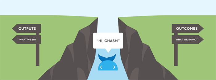
These are difficult, but important questions that a nonprofit should be able to answer and more importantly measure. Before drilling down on answering these questions, it is critical to have defined the larger impact measurement of outcomes for your nonprofit. Once the larger inputs, outputs and outcomes of the organization have been defined they may be applied to the digital impact mapping process. Digital impact mapping is the process of defining the exact set online behaviors that best reflect the type of action stakeholders need to take to eventually lead to the outcome of the organization. This map then serves as the bridge that helps a nonprofit cross the digital impact chasm that exists between what is done digitally and what happens in the world to create a societal benefit.
 Addressing the Digital Impact Chasm
Picture a chasm. On one side there is the digital marketing, communication and content work your organization does on a daily basis and on the other side are long-term societal benefits. While there are concrete outputs being created like emails and online content, how can you tell if this work is moving the needle on long-term impact? The most common answer to this is usually some digital vanity metric like page views, sessions, likes or followers. A vanity metric, is a vain number that may present the appearance of scale but ultimately holds low relevance to real impact. The key to avoiding these vanity metrics is to define predictive indicators that connect to real action.
“We are lost, but at least we’re making great time.” – Leap of Reason, Mario Morino
Without addressing the digital impact chasm a nonprofit can quickly drive in the wrong direction. Think of predictive indicators as the bridge across the chasm, the smoke and heat that indicate there is a fire. These indicators can then serve as a speedometer on the car with a GPS, helping you know if you are staying within the speed limit while traveling toward the destination.
“You’re so vain, you probably think this metric is about you” – Whole Whale (Carly Simon joke)
Identifying Predictive Digital Indicators
Digital indicators target the measurable elements of an organization’s online activities and outputs. The digital realm is awash in dashboards and big data, constantly churning out far more than can be synthesized.
“….information consumes the attention of its recipients. Hence a wealth of information creates a poverty of attention.” – Herbert Simon
It is easy to collect a bevy of vanity or high level metrics like website users, social likes/reach, and content impressions. Every digital tool that an organization uses presents yet another dashboard, with a new set of metrics to chase. We must remember that for every metric that is added to the heap, the less attention there will be for any given metric – even the ones that matter. This makes the job of defining the right digital indicators critically important in dealing with the poverty of attention.
Defining SMART Indicators
The SMART acronym helps create some guard rails on the attributes of good digital indicators.
Specific
Measurable
Actionable
Relevant
Time Bound
(more about defining indicators https://www.wholewhale.com/impact/)
Building the Engagement Funnel

The next step is to align predictive digital indicators with the according step in the engagement funnel. This helps give context and relative value to metrics and build the larger narrative that they all build on each other to achieve the outcome. In this context, even social likes can be built into the narrative and not just seen as a vanity metric – assuming that it actually relates to the outcome your funnel points toward.
This funnel will also help your team realize the value of digital marketing, content and communications because it puts them in context of the larger outcome. Also, the funnel then presents opportunities for optimization between funnel steps like A/B testing email request forms or donation pages. For example, if you improve conversion to an email form by 200%, that doubles the effectiveness of the entire top of the funnel’s traffic metric without spending any money on ads.
Measurability Framework
The question that frequently comes up once predictive metrics are defined is ‘how often do we measure it’? The unsatisfying answer is – it depends on who you are and what your job role is. An organization should have a larger unifying metric such as: children educated, stakeholders helped, or awareness threshold reached. This ‘northstar’ metric can then be used to add context and relevance to supporting metrics that different departments feed into.
The funnel of engagement is a perfect model to build that chain of relevance, the next question is how to use these predictive indicators. Whole Whale created an approach that helps plot the relevance to ease of measurability of the various metrics that can be tracked. This model helps the team acknowledge the assumptions and compromises that are being made when certain metrics are chosen over others because of the ability to measure them.
The blue line that divides the area will help you avoid measuring things simply because they are easier to measure leading to the “Streetlight Effect”. This effect leads us to look for observations where the light is rather than where the answers are. In the case of this model, the goal is to choose metrics in the top left area and avoid the lower right at all costs.


Once indicators are plotted by organizational department or function, it will be easier to look at them objectively and determine the frequency at which they should be measured. In general, the easier the metric is to measure, the easier it is to look at it on weekly/monthly basis. This is a good starting point as long as the metric is a predictive indicator that leads to the north star metric of the organization. Harder to measure indicators can be looked at on a quarterly/annual basis to make sure the larger outputs of the organization are aligned with the outcomes.

In the example above, we use Power Poetry, the largest online platform for teens and poetry. Their long term outcome is to increase the literacy rate in young people, and the predictive indicators that matter most are the number of poets and poems created in the system. An externality of this work would be decreased prison rates, as illiteracy is the most common factor among the incarcerated population. However, measuring this would be incredibly difficult, which is why it is in the bottom right and not actually as relevant to the core goal.
As more metrics are added to this measurability framework, the relationship to measurability helps become realistic about how frequently they should be measured. In this example with Words Without Borders, an organization that promotes cultural awareness through translation of international literature, measurability directly correlates to frequency.

Use this measurability framework as an exercise to plot your organization’s key metrics and have honest conversations about their true relevance to mission. Then come back and assess the measurability to determine where it should fit in frequency of measurement.
Dashboards and Feedback Loops
There are many tools that can be used to create dashboards and every web, social, and CRM has different versions and views of data. The key is to find the right way to bundle the metrics needed for each department and person depending on their job. Creating this dashboard through Google Analytics, Google 360 Studio or a third-party like Domo.com or Sumall.com is the first step.
Many teams stop at dashboard creation step, and assume just because they may have a live feed of data in the waiting area tv screen that the organization all set. Dashboards only become useful once they are adopted into the processes of the different departments in an organization. This can range from getting automatic delivery of dashboards to your email, or getting data texted to you through AllGoodText.com. Ideally, key metrics and dashboards are introduced into standing meetings and built into staff performance reporting structures.
The ability for key metrics to influence behavior within an organization depends on creating feedback loops. In the same way that a car’s speedometer influences how fast people drive when combined with speed limit signs, showing staff how their behavior influences key metrics positively or negatively will have a similar effect. This is the beginning of creating a data culture within your organization.
Resources
- Google Dashboards- https://www.wholewhale.com/make-great-google-analytics-dashboards/
- BHAG Chart https://www.wholewhale.com/tips/nonprofit-digital-impact-mapping-template/
- More reading on general impact measurement from SSIR – http://ssir.org/articles/category/measuring_social_impact
- Research from McKinsey on measuring marketing impact – http://www.mckinsey.com/business-functions/marketing-and-sales/our-insights/discussions-on-digital-measuring-marketings-impact
- Leap of Reason – great book on broader impact measurement – http://leapofreason.org/